> For the complete documentation index, see [llms.txt](https://docs.makerobos.com/frontman-enterprise-chatbot-platform/llms.txt). Markdown versions of documentation pages are available by appending `.md` to page URLs; this page is available as [Markdown](https://docs.makerobos.com/frontman-enterprise-chatbot-platform/story-builder/cards/display-cards/carousel.md).

# Carousel

### How it Works?

The Carousel card offers an interactive way to showcase multiple images within your AI conversations. This format allows you to present up to nine individual "cards" each featuring:

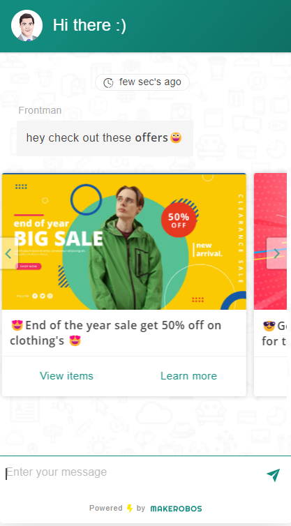
1. Carousel: This is the main carousel style with a minimum requirement of two cards. Each card can have an image, title (up to 70 characters), description (up to 100 characters), and URL. Remember the image size can't exceed 2mb.

<figure><img src="https://3746379134-files.gitbook.io/~/files/v0/b/gitbook-x-prod.appspot.com/o/spaces%2FamP4egBrOsuezKyj1NQl%2Fuploads%2F0oOok1dlR4KFRM7MDofk%2FCrousel.png?alt=media&amp;token=34d632db-0604-42b6-81d5-ece08b7cfb31" alt=""><figcaption></figcaption></figure>

<div align="left"><figure><img src="https://3746379134-files.gitbook.io/~/files/v0/b/gitbook-x-prod.appspot.com/o/spaces%2FamP4egBrOsuezKyj1NQl%2Fuploads%2FanN61Q34wutT8H6J3GZs%2Fimage.png?alt=media&amp;token=3dff553b-836f-47d4-ae68-ad958ae67189" alt="" width="210"><figcaption><p>Chatbot preview</p></figcaption></figure></div>

2. Slideshow: Similar to carousel but focuses on images with titles (up to 24 characters) and URLs. Basically, the outcomes comes as an sliding images one after another.

<figure><img src="https://3746379134-files.gitbook.io/~/files/v0/b/gitbook-x-prod.appspot.com/o/spaces%2FamP4egBrOsuezKyj1NQl%2Fuploads%2Fb3PQIdR2iruJ0M7TBMCl%2Fslide%20show.png?alt=media&amp;token=51fb28b4-c982-417e-aecd-527f438f290f" alt=""><figcaption></figcaption></figure>

<div align="left"><figure><img src="https://3746379134-files.gitbook.io/~/files/v0/b/gitbook-x-prod.appspot.com/o/spaces%2FamP4egBrOsuezKyj1NQl%2Fuploads%2FrgaaC2KyQlwa5GE4zaAZ%2Fimage.png?alt=media&amp;token=ac6bfcff-3602-47fe-af04-c9eb2b1b93d0" alt="" width="211"><figcaption></figcaption></figure></div>

3. Infocard: These are a user-friendly way to present information in a concise and visually appealing format. Each card combines an image, a title, a description, and a call to action button. This style works best when you have multiple points to showcase, requiring a minimum of two cards for effective presentation.

   <figure><img src="https://3746379134-files.gitbook.io/~/files/v0/b/gitbook-x-prod.appspot.com/o/spaces%2FamP4egBrOsuezKyj1NQl%2Fuploads%2FgygDREYgfWGQrt73RHWX%2Finfor.png?alt=media&amp;token=8019a80a-ff61-4288-98f9-6e64f117fb8b" alt=""><figcaption></figcaption></figure>

   <div align="left"><figure><img src="https://3746379134-files.gitbook.io/~/files/v0/b/gitbook-x-prod.appspot.com/o/spaces%2FamP4egBrOsuezKyj1NQl%2Fuploads%2FUwV3tsz5fbzy6zQk88J0%2Fimage.png?alt=media&amp;token=1035cd9b-e35e-41eb-8025-f0c9c793c464" alt="" width="209"><figcaption></figcaption></figure></div>

   <div align="left"><figure><img src="https://3746379134-files.gitbook.io/~/files/v0/b/gitbook-x-prod.appspot.com/o/spaces%2FamP4egBrOsuezKyj1NQl%2Fuploads%2FPEskK1zJcv69Gi8JaAcJ%2Fimage.png?alt=media&amp;token=f8feedd0-ddbd-4816-a14b-843969462072" alt="" width="212"><figcaption></figcaption></figure></div>

### **Key Points:**

* **Minimum Requirement:** While you can showcase upto 9 images, a minimum of 2 cards is required to activate any functionality.
* **Overlay Option:** Enable the overlay feature to display additional information on top of the image when a user hovers over it. This can be useful for providing more detailed descriptions without overwhelming the initial view.